Brand Guidelines
Logos
The Asphalt Institute logo lies at the heart of our visual identity and should be featured prominently in all communications and promotional materials. This is the primary logo and should be utilized for all appropriate applications. Master files in a variety of different formats can be acquired from the marketing team.
In some cases, alternate versions of the primary logo may be better suited to your needs. If you have questions on which logo to use, please contact the Membership and Marketing team.
Sizing and Clear Space
When using the Asphalt Institute logo, make sure to have the proper amount of space around the logo. This is achieved by making the total height of the logomark equal “X”. Then using the measurement of “X”, make sure there is 1X of space on all sides of the logo.
Minimum size refers to the smallest dimensions allowed for the logo. The logo should never be reduced below the minimum widths of 1.5 inches for print and 72 pixels for digital.
Logo Colors
The logo should almost always appear in full color.
Use the reverse logo on black or very dark backgrounds. If the background color happens to be similar to either logo color and blends together, please use the white logo for maximum legibility.
The black version should be used when only one color is available or for lower quality applications like packaging or casting. The white logo can be used in the same manner when a negative version is needed.
Additional Logos
These logos represent publications, programs, and other special initiatives of Asphalt Institute. Master files in a variety of different formats can be acquired from the Membership and Marketing team.
Colors
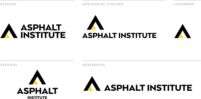
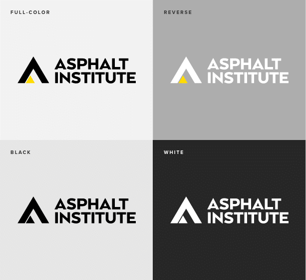
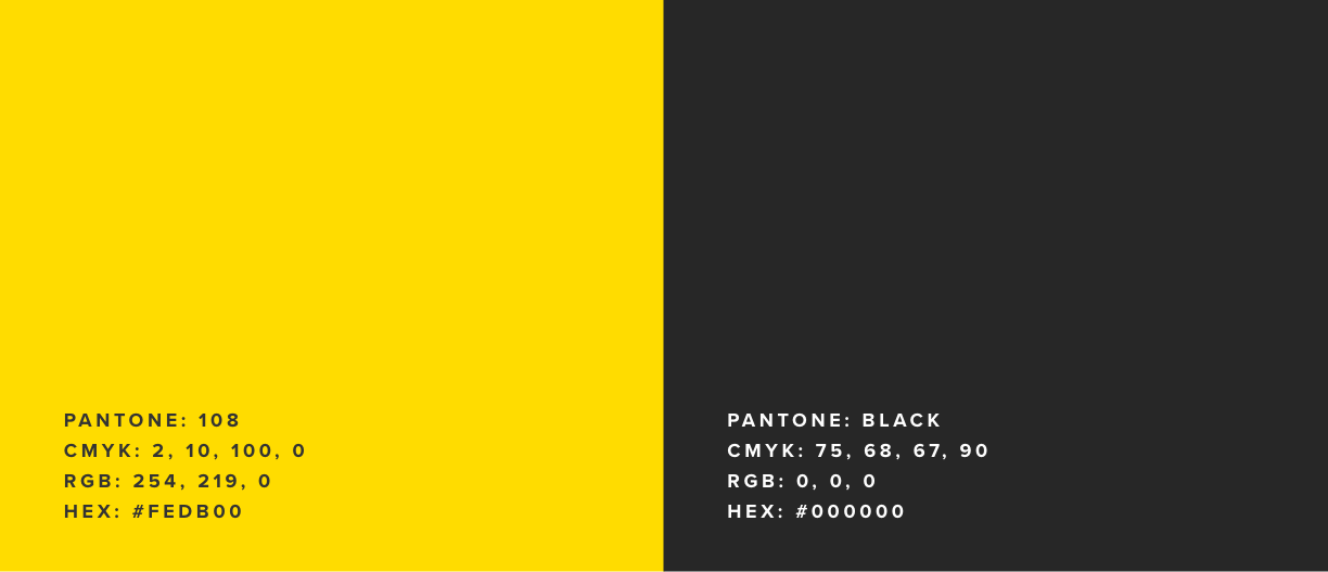
The official colors for Asphalt Institute are Pantone 108 and Black. In most cases there will be a need for alternative “builds” of the color when printing with Pantone inks is not available. These color codes represent several ways to achieve consistent color for Pantone 108 across many formats.
RGB
Preferred colors, use whenever possible.
PMS
When printing, use PMS (Pantone®Matching System) inks whenever possible.
CMYK
Use CMYK colors to print only when PMS is not an option.
Typography
When possible, use New Science for headlines and Proxima Nova for body copy.
In situations where New Science and Proxima Nova are unavailable, such as a web format or Microsoft Office product whose files will be emailed outside the realm of font owners, revert to Aptos.

